What your readers can do with it
The statistics calculator has three tabs, and each one replaces something students otherwise hunt for: a spreadsheet, a graphing calculator menu or the table at the back of the textbook.
- Describe data: paste numbers separated by spaces, commas or new lines. Out come n, mean, median, mode, quartiles, sample and population standard deviation, outliers by the 1.5 IQR rule, a histogram and a box plot. Anything that is not a number is skipped and listed.
- Regression: one x, y pair per line. Linear, quadratic, exponential and power fits, each with R², and a box to predict y at a chosen x.
- Distributions: normal, t, chi-square and F. Readers get P(X ≤ x), P(X ≥ x), the probability between two values, or a critical value for any α and any degrees of freedom, not only the ones printed in a table.
Where it fits
Put it under a data set in a lesson on spread, so students compare their hand-worked standard deviation with the tool's sample and population values and see why n − 1 matters. In a lab course, students can paste their own readings into the widget on the lab page. On a hypothesis testing page, the Distributions tab stands in for the t table: "Find the two-tailed critical value for α = 0.05 with 10 degrees of freedom."
Suggested size
The default frame is 820 px high and up to 960 px wide. That shows the data box, the summary cards and the top of the histogram. The box plot and the regression graph sit lower and scroll inside the frame; give it 1,000 px if the charts are the point of your page. On a phone the tool is about 970 px tall.
What it opens on
The widget opens on fifteen test scores, already summarised: n = 15, mean 80.2, median 82, sample standard deviation 11.8394, Q1 = 70 and Q3 = 90, with the histogram underneath. It does not read data from its address yet, so to use your own data set, print it on your page and ask readers to paste it into the box; the summary updates when they press Calculate. A data set of 10 to 30 values is easiest to copy and still shows a useful histogram.
Add it in three steps
- Choose the height (taller if you want the charts in view) and press Copy embed code.
- Paste the code into your course page: an HTML block in WordPress, the HTML editor in Canvas or Moodle, or Embed code in Google Sites.
- Put your data set right above the widget so readers can copy it straight in.
Frequently asked questions
Does it give sample or population standard deviation?
Both. The summary shows the sample value s, which divides by n − 1, and the population value σ, which divides by n, so students can see the difference for their own data.
Can students look up t critical values in the widget?
Yes. On the Distributions tab they choose Student t, type the degrees of freedom, pick the two-tailed critical value and type α. For 10 degrees of freedom and α = 0.05 it gives 2.228.
Can I load my own data into the widget from the link?
Not yet. It opens on the test score example every time. Print your data beside the widget and readers can paste it in.
More calculator widgets
Want the explanations and worked examples as well? They are on the full Statistics Calculator page. All 24 widgets, each with a Copy code button, are in the calculator widget gallery.
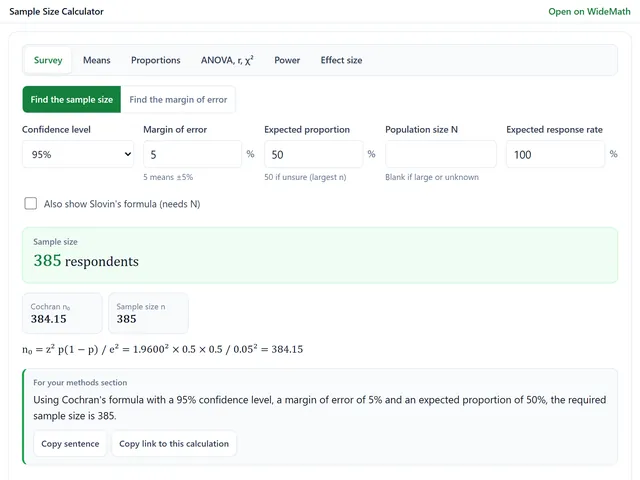
Sample Size Calculator
Survey sample sizes and power analysis for t-tests, ANOVA, proportions and chi-square.
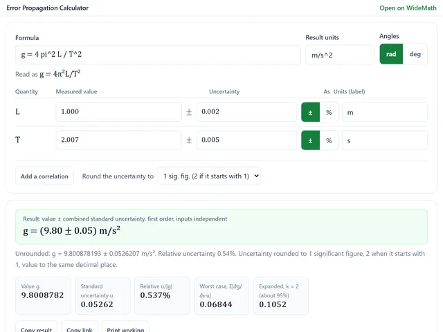
Error Propagation Calculator
Uncertainty of any formula, with the partial derivatives, each input's share and a Monte Carlo check.
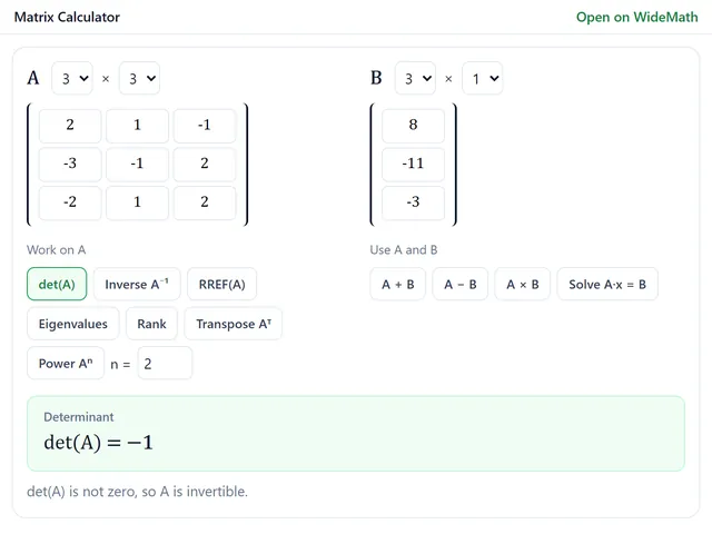
Matrix Calculator
Exact-fraction determinants, inverses, RREF and eigenvalues up to 6 × 6, with every row operation.